

Step by step guide to make your home more colourful
/I was inspired by
's press release last week, introducing popsicle colours to interiors. Think washes of watercolours married with strong statement fabrics. I love it. It's a particularly nice trend for the Summer months.
Here's how I'd introduce colour to a room step by step. I hope it helps you if you're thinking about redecorating.

1. Choose 3 key, bright colours that complement one another
And use these colours to guide your choices when you're out shopping for room accessories. Opt for materials, furnishings and statement furniture in these shades... but don't go overboard. Limit yourself to 30% of the room in these colours.
You might notice the shades I've chosen resemble my blog design. There's something about these 3 contrasting shades that I love together, although I think it breaks every design rule in the book.
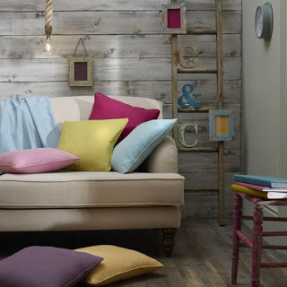
have some brave and beautiful fabrics for every home that continue to inspire me (see the pic on the right for an action shot). All of these shades are taken from their material collection and can be used for upholstering anything from cushions to sofas to curtains for a bold statement.
2. Next, find a texture or base shade that complements the colour scheme
Think about neutral shades for this. Ideally a blank canvas paint you can coat on the walls in a muted tone that plays down all the bright colours yet brings them together.
is a fantastic choice if you want to give your walls a fresh lick of paint. With over 2,000 pre-mixed colours, the choice doesn't stop there. If there's a fabric colour you want an exact match with, they can mix it identically for you. We recently painted our bedroom a matt, neutral '
Summer Gray'
from Valspar's collection which was a dream to work with. I'll show you photos once the place is tidier ;)

Don't feel obliged to coat your room all one colour though, you could choose to wallpaper one accent wall for more texture to pastel colours. I love this Vintage Flock design by
Kelly Hoppen for Graham & Brown
. It's neutral enough to not clash with colours, and adds a bit more detail to the primary shades I've chosen.
3. Invest in good quality furniture with changeable covers
I often find myself wanting to change colours schemes regularly particularly when I see how fast interior trends change. Furniture stockists like
make it totally possible to buy an excellent quality piece of furniture with the ability to change the covers. Their range of materials are next to none. If I was on the market for another sofa, I'd ditch DFS and head to Loaf as my first port of call. Delivery is a million times faster than highstreet chains too, so you won't have to resort to camping chairs for 10 weeks like we had to when we bought with DFS. The classic button style
Dixie sofa in Bahama plush velvet
would look beautiful with contrasting cushions from
.

4. Make a pinterest board of home furnishings you love in shades that work with the scheme
This is my favourite past time. Take a look at the
I made when I re-decorated my mum's bedroom. She loved the colour lilac, so I went mad on creams and purple tones to decorate her room with.
enabled me to redecorate her room in under £200, their homeware range is fantastic if you're working to a budget.
The pro's of making a pinterest board of all your potential purchases is that Pinterest can alert you when products go on sale, so you can hang about and save pennies whilst getting creative. High fives all round.
Some things I'd pin for this look:
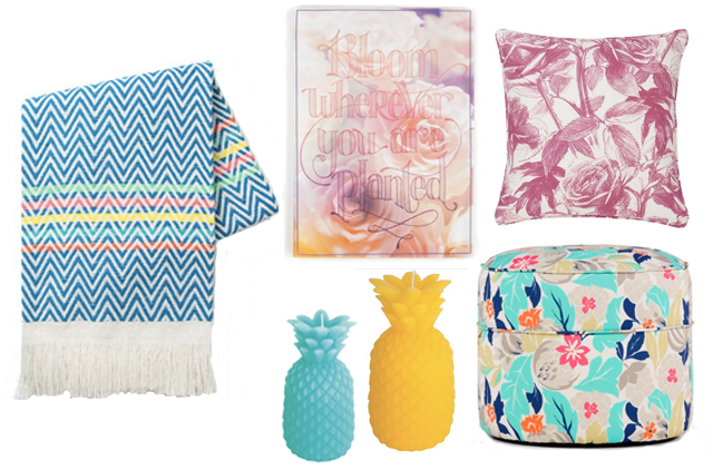
- Oliver Bonas
- Graham & Brown
Empress Rose cushion in magenta
- Clarke & Clarke
- Oliver Bonas
- MADE
I hope this has inspired you to add new colours to your rooms. I think it pays to be daring when you're redecorating. If it doesn't work out, it can always be replaced.