Choosing our new living room colour scheme

The second home resolution for 2016 is ticked off the list (well, sorta).
If you've read my 10 home resolutions for 2016 post you'll have seen me list all of the things I want to change in our flat this year. When people move into a new home, or have work done to their house, they're often in a huge impatient rush to get it finished which can often mean decisions can be made too hastily and what worked for you earlier in the year has now changed as you've got used of your new space. With this in mind I've vowed to take things slow decorating-wise. Read this post for more about this, and why you should slow down too.
Surprisingly, I've ended up decorating things faster than I thought.
Taking away the pressure to do everything at the speed of light has made me firm up on decisions and take focus, without the time constraints I put on myself looming. So this slow decorating approach is working out great.
Come inside our living room quick, this is what it looks like now...
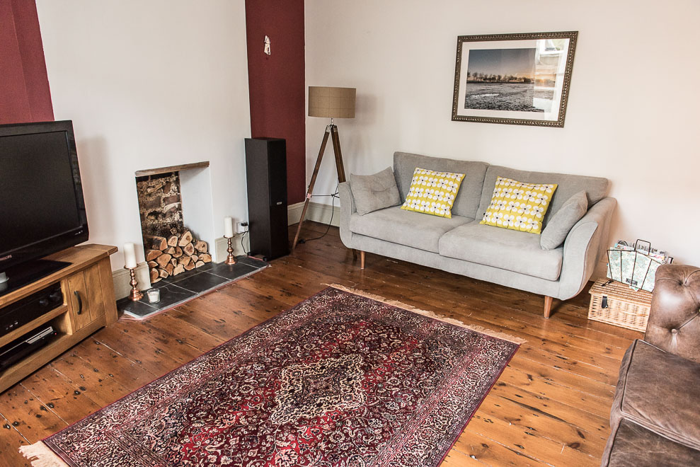
My first New Year's home resolution: "Choose a fresh new colour scheme for our living room"
Obviously living in a Victorian flat, this had to be Farrow & Ball. I absolutely adore their muted, matt paint shades in various tones that really work with period properties. There's an element of class with F&B colour schemes that I've always wanted to recreate in my own home, so I spent the best part of my new year on their website soaking in all the colour advice and scrolling through the customer inspiration photos (they're addictive to look at seriously, and so helpful for the days I had colour doubt).
I chose the wrong wallpaper at first... oopsie.
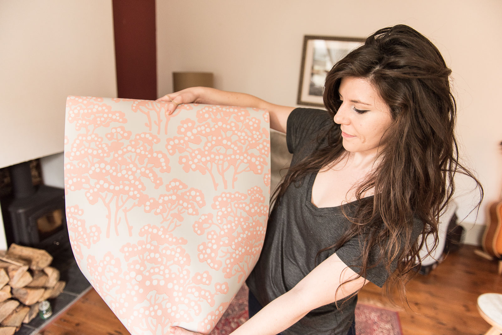
I recently shared a peek at Farrow & Ball's new countryside wallpaper collection. It's stunning. The patterns are inspired by the rolling hills of the Dorset countryside where their head quarters are based. I initially had plans to use their Hornbeam wallpaper (pictured above) inside the alcoves of our living room, but since our stay at Starnash Farmhouse where I became really inspired by their stone coloured walls next to fresh white trims, I decided against the pinks and greys of Hornbeam for our living room in favour of earthy tones.
So I continued the search on Farrow & Ball's website, looking for stone shades that weren't too dark, grey in tone and something a little warmer to match well with our wood floors and Chesterfield sofa.
I know I want wallpaper either inside our alcoves or on our chimney breast to bring pattern and detail to the room.
The minute I saw Farrow & Ball's Peony BP 2301 I knew it was the one I wanted. This is the final colour scheme I've gone for.

Left to right, Peony BP 2301 wallpaper, Wimborne White No. 239, and Skimming Stone No. 241
Skimming Stone will wash all of the walls and bring warmth to the room. Wimborne White will give the look some clean lines painted on all of the trim, door and window, and that beautiful Peony print will sit on our chimney breast for a main focal point.
All that's left to do now is find the right painter/decorator at a reasonable cost. They seem pretty hard to come by in Brighton so I'm keeping fingers crossed I find someone soon so I can get this done and move onto finding some complimentary shutters for the room.
Hope you like.