Stick the kettle on


Hello
We’re Fi + Neil
We help new renovators create their dream homes, minus the stress!
How to Choose Paint Colours: 5 Interior Designer Favourites
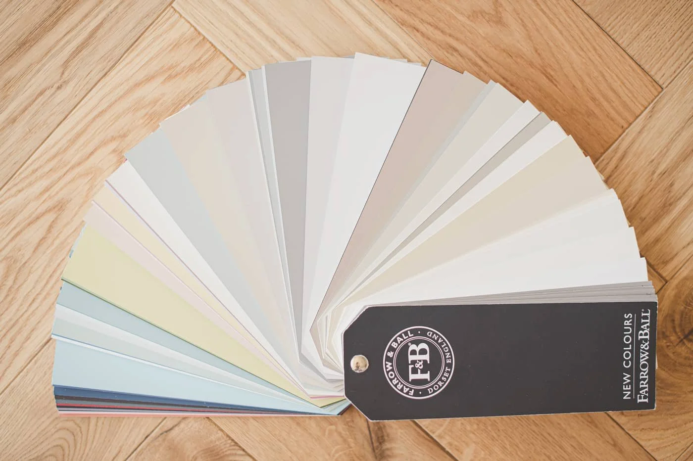
Choosing the right paint colour can completely change how your home feels. In this guide, an interior designer explains how to choose warm or cool colours, sample paint correctly, and shares five timeless paint colours that work beautifully in real homes.

How to select a truly cohesive colour scheme for your home
Selecting a cohesive colour scheme is tough but important! This guide explains why and how to make colour decisions you’re really pleased with…
How to select a truly cohesive colour scheme for your home
Selecting a cohesive colour scheme is tough but important! This guide explains why and how to make colour decisions you’re really pleased with…

Decorate yourself happy
I've teamed up with Dulux to bring you the antidote to the Blue Monday effect – we want to introduce happy colour into your home, so you can decorate your way to a happier home.