How to select a truly cohesive colour scheme for your home

Cohesion is definitely a buzz-word in the interior design industry but it’s one of the most important design techniques to practice in a property for SO many reasons. In fact, one of the most rewarding emails I’ve ever received was from a client who after months of painstakingly trying tester after tester, called in my support. No matter how hard she tried she couldn’t find a colour to work, so I practiced techniques I’ve learned over the years and with some careful thought put forward the perfect scheme for her….

It is the best feeling when colour decisions fall into place. You’ll know you’re onto a winner the moment your roller does the first glide across the wall.
Even in our 1930s house I’ve developed a light, airy and cohesive scheme and it’s thanks to the tips I’m sharing below and in my Home Design Lab classes that I’ve been able to achieve cohesion in a really straight forward way.
First, why are cohesive colour schemes important?
Top of the list is that a cohesive home won’t look like a crazy mish-mash of styles (so long as you can develop that sense of cohesion well). And it also prevents any disjointed feeling that can be experienced walking between rooms.
Ultimately cohesion is a technique in interior design that I believe every home needs no matter what colours, layout, or light you’re working with. We all desire it, and I strongly believe we can all achieve it with a little guidance.
In fact, when I was doing more extensive research for Home Design Lab, I discovered a possible reason we desire cohesion so much…
Our subconscious brain loves predictability.
It’s true.
Walk through a cohesive home that has a similar style and colour scheme running throughout each room and your subconscious brain feels rewarded by that sense of completion and repetition.
On the contrary, walk through a home that’s got one deep dark, ink blue room, another bright yellow room, and the rest neutral spaces, and your brain is met with colours that are unpredictable in your home, bringing that disjointed feeling.
You might not even be able to articulate what’s feeling ‘off’ in your home, but you can feel it’s not right when cohesion isn’t present.
And if that hasn’t convinced you enough, there’s another rule in interior design called The Triangular Rule where this subconscious desire for completion comes into play. The Triangular Rule (not to be confused with the Triangulation Method used in kitchen design) is where you position furniture or, say, items on a shelf in a triangular position completing the geometry at 3 points. It brings balance and flow to a room. But when one of those three points aren’t there, it can make your brain feel a bit unbalanced, you’re subconsciously trying to complete the geometry.
Home Design Lab goes into more detail about the rules we often don’t practice in interior design and how to apply them to your home and layout, but ultimately it all comes down to creating cohesion which is the backbone of my own interior design practice and the courses I share for our community.
So how do you actually develop a cohesive colour scheme?
There are many ways you can bring cohesion to a property but today I want to give you a few tips on achieving cohesion through your colour scheme.
No guides ever show you how to actually achieve cohesion. So in true Fifi McGee style I’m going to tell you a few ways to approach colour and cohesion in your home so your brains can feel that sense of completion I spoke about earlier…

Tip 1: Choose colours for your home as a whole, not as individual rooms
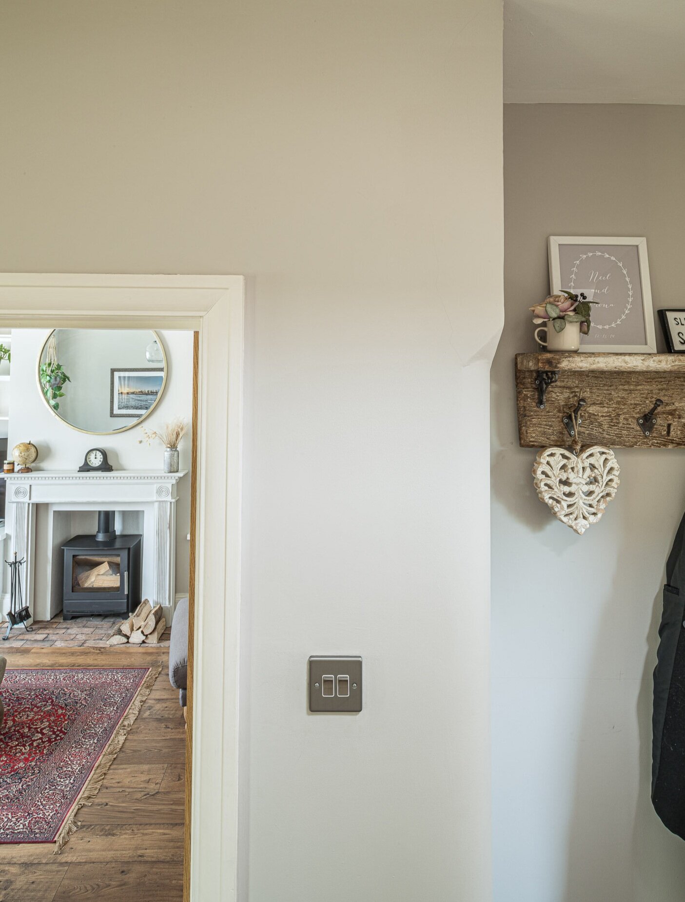
The very first tip I’ll share is this. Try not to choose colours one room at a time, and instead choose colours with the adjoining rooms in mind too. I see it happen too often where homeowners focus all their efforts on their kitchen design, for example. They choose specific colours for the cabinets, the walls and the zones around the kitchen like the dining area but no thought is given to the hallway as you enter the kitchen, or the living room that you can see from the kitchen. Homeowners end up in a bit of a pickle and pressured to choose colours later on because they didn’t think ahead.
Sometimes it works and you find a way, but the less stressful and more cohesive method is to choose colours for multiple rooms at once – even when you know you won’t be decorating them any time soon. Home Design Lab has a full module dedicated to teaching members the know-how with colour, and how exactly to draw complementary colour schemes that can be applied to a full property. It’s a really eye-opening module with a lot of in-depth (and rather geeky!) info on which colours work best for the different aspects of your house. If you’ve got a dark room you’re struggling to find the right colour for, the answers are all in Home Design Lab.
Tip 2: Make sure the colours you’re choosing have consistent saturation levels
When I found out about this technique, it changed everything. I go into much more depth in the course, but in short – people often think that a cohesive colour scheme is achieved if you go for the same neutrals or colours throughout a property. Yes, that’s one way of doing it. But why limit your palette to just 3 or 4 colours throughout a house when you want to express your personality differently in different rooms?
The secret to having multiple colours in a home and keeping cohesion, is by ensuring the colours you’re choosing have very similar saturation levels.
Saturation, in really simple terms, is how ‘primary’ a colour is. A red that is high saturation is like a primary red, bright and bold. A red that is low saturation is much more muted, I guess more like a maroon red that’s deeper and more complex in tone. Low saturation colours tend to be timeless and atmospheric. High saturation colours bring energy and fun to a home.
For true cohesion, don’t mix high and low saturation levels in the same room. And if you can help it, don’t mix high and low saturation colours in the same property. If you want to learn more about which colours are right for your personality and settle on colours that will suit yours and your family’s desires in shared spaces, then you need to work through some of the excavation exercises delivered in Home Design Lab because our members are developing colour schemes that are cohesive and loved by everyone in their households.

Designing your own home? Let us help!
Our FREE 3 day email series guides you through the essentials you need to know to:
Nail your interior design choices
Avoid common mistakes
What to look out for before you start
Tip 3: Spend just as much time working on your material choices
We focus a lot on paint colour, and rightly so. Paint colours make up a large proportion of what we see in a home. But I see people getting so caught up on colour choices for their walls/ceilings that they neglect to consider materials.
Materials (i.e your worktops, your floors, curtains, rugs, accessories…) contain colour too and they bring an amazing sense of depth that can really throw the cohesion of a home ‘off’ if you don’t consider them early on. You see, materials have the impact to change the way a wall/ceiling/woodwork colour looks completely.

Let’s pretend you have your heart set on deep blue kitchen walls. Well, if you put a crisp white Corian worktop next to it, or a warm honey oak worktop next to it, that deep blue is going to appear very different! For ultimate cohesion in a home, you need to be considering what colours are contained in the materials you’re choosing and how they’ll look next to the walls, ceilings and woodwork colours you’re choosing. Going back to my earlier tip, when things feel ‘off’ in a room it can often be when low and high saturation colours are brought into the same scheme. Make sure you’re bringing your material colours into your colour schemes and you’ll be able to ensure cohesion flows through the house.
Those are just 3 tips on how to select colours for cohesion. There are many, many other tricks to bring cohesion to a home that I reveal and support members with in the Home Design Lab program.
As I advise members, colours and materials really make a home come to life – they’re like the icing on the cake so to speak. But nothing is more important than getting your layout right for that real sense of flow through a property. We go into depth on layout and how to visualise your options, so come on over and explore our online courses to determine which is right for you.
I’d love to support you with your home design
There are a number of ways I’d love to help you with your home plans.

Decorating a property? Want to deep dive on your home design plans and get the know-how from an interior designer, without completely handing over control (and the hefty fees!)? Home Design Lab is for those who are committed to learning the ropes of interior design in order to get an incredible finish in their property that speaks to their personality.
Want to get started with some free tips and tricks to get you started on your home design journey? Get our free 3 day email series How to Design Your Dream Home today.
I hope that this post has helped you understand more about developing a cohesive colour scheme and I’m throwing all the best of luck your way with your colour plans!
Fi xoxo