How to Choose Paint Colours: 5 Interior Designer Favourites
Guys, I’ve tested hundreds of paint colours over the years, but these 5 beat them all.
They work in almost any home and I return to them again and again in clients homes. So if you’re stuck choosing paint colours, these will make your home feel timeless and stylish, as if they’ve been selected for you by an interior designer 👇🏻
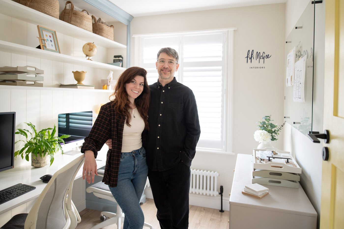
Btw hello if you’re new here, I’m Fi 👋🏻 And that’s my partner Neil. I’m an interior designer, and I help homeowners create your dream home confidently and affordably. Neil runs the company with me.
I’m all about the nitty gritty design details and sharing insider design secrets that actually work for real homes. It’s so great to have you here!
OK before I get into the 5 colours, I want to share thethinking behind them as well as some quick tips on painting your samples correctly. Many people get this part wrong and end up really not liking the paint colour they thought would be the one…
Why these colours work (the science)
All of the colours I recommend to clients are inspired by nature. Our brains evolved in natural environments, not in houses, offices, or cities. And we instinctively respond to certain landscapes, colours, and patterns as safe, familiar and restorative.
By the way, this is science backed. And it’s called Biophilic design.
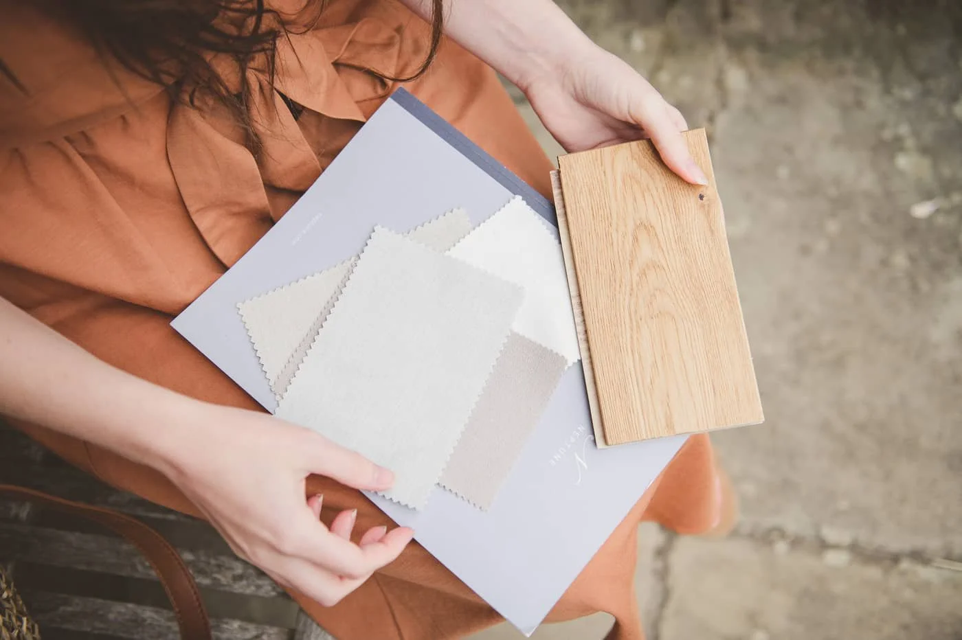
What is biophilic design?
It's an interior design approach that brings nature into your home to improve how the space feels and functions.
Research suggests biophilic design can help reduce stress, improve mood, support creativity and make a home feel more comfortable.
One of the easiest ways to introduce biophilic design is through your choice of paint colour.
How do paint colours affect your mood?
The short answer is that different colours create different emotional responses, although lighting, materials and personal preference all play a part.
When choosing paint colours, the biggest distinction is between warm and cool colours.
🔴 There are warm colours— Warm paint colours include earthy neutrals, terracotta, warm whites, olive greens and warm blues. They generally make rooms feel cosy, welcoming and grounded.
🔵 And there are cool colours — Cool paint colours include blue-greys, crisp whites and cooler blues. They usually create a calm, fresh feeling but can feel stark if they're overused.
Warm and cool don't describe how bright a colour is. They describe the undertones within the colour.
In most homes I prefer warm colours because they're generally easier to live with every day and create a more welcoming atmosphere.
What's the world's favourite colour? 🤓
A large international survey found that one of the world's favourite colours is teal, a blend of blue and green.
Yep. That beautiful, calming hue. Blue and green are strongly associated with nature, which may be one reason these colours are so widely liked.
I truly think it’s because we all crave that sense of tranquility in our lives - a small pocket of calm in the chaos of everyday life. And where better to create that, than in your own home where you spend most of your day?
If you're nervous about using bold colours, muted blue-greens are one of the easiest ways to add colour without overwhelming a room.
How should you sample paint colours?
Don’t just paint them directly onto your walls. Instead use large boards to translate the colour correctly. Then move them around your home and look at them in daylight, evening light and artificial light before making a decision.
Most homeowners I speak to skip this step, which is why so many end up disappointed when the paint is on every wall.
If you’ve ever bought a tin of paint that looks nothing like the sample or the colour card, make sure you try this….
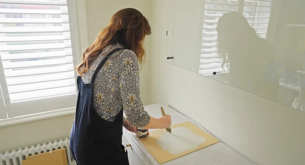
When you’re testing your paints, a designer tip is instead of painting directly onto your walls, grab some A3 boards (I buy mine from Amazon) and paint your tester pot on that rather than directly onto your wall.
I go a bit extra and use a sticker maker to label them so I don’t get confused, and what you end up with is a board you can easily move around the room to see how the colour looks and behaves in different lights, against various finishes & furnishings and on all 4 walls.

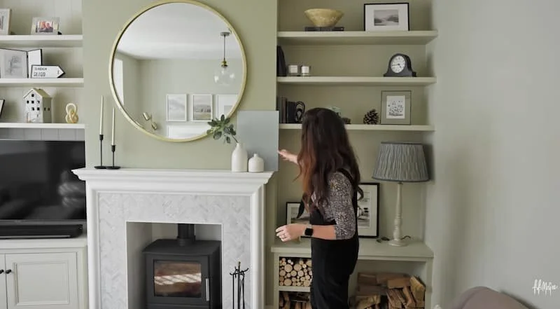
This has big advantages:
Your sample isn't influenced by the existing wall colour, so you see the true paint colour.
You don't have to cover large test patches when you start decorating.
You build a library of paint samples you can reuse in different rooms and future homes long term.
You can easily watch how the colour changes. North-facing, south-facing, east-facing and west-facing rooms can make the same paint colour look completely different.
I like to keep them propped up for a few days to watch how the tones change from morning to evening so you feel really happy with your choice.
The 5 Paint Colours I Recommend Again and Again
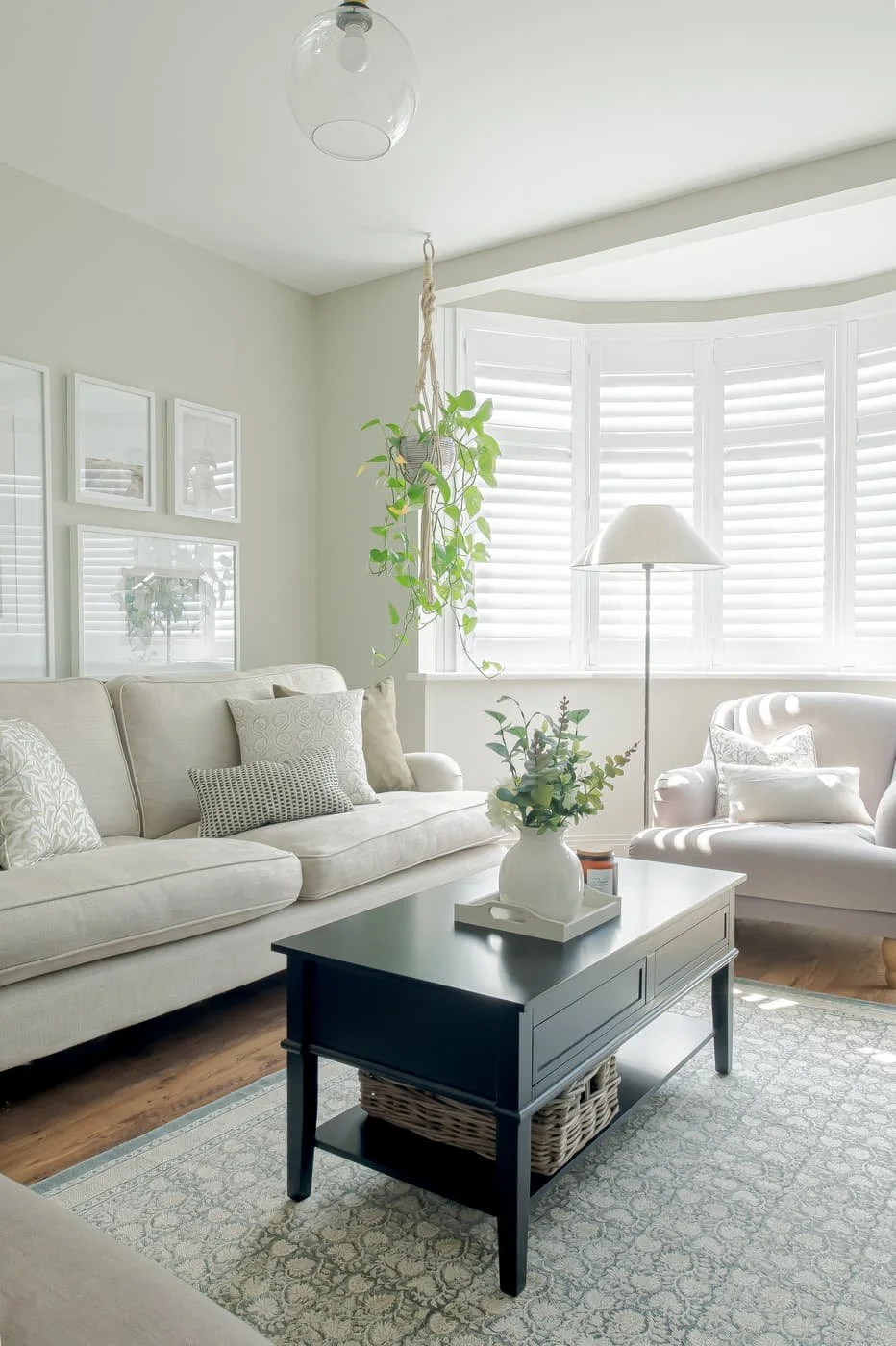
Shaded white, farrow & ball
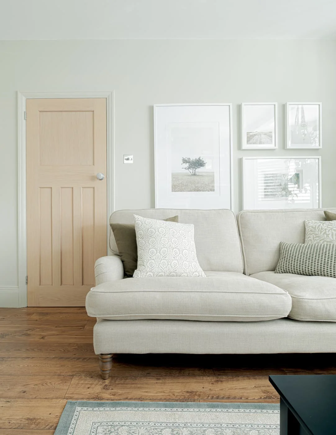
Shaded white, farrow & ball
Best warm white paint: Shaded White by Farrow & Ball
Shaded White is a warm off-white that works in both bright and darker rooms because its soft undertones prevent it feeling stark.
I honestly feel like it’s my signature colour at this stage (sorry other interior designers - I’m claiming this!😅) because I’ve used this in countless homes. It’s a soft, beige-toned neutral with subtle grey undertones. And it works in both bright and dark rooms, without it ever feeling stark or oppressive.
I recommend applying it anywhere you want warmth but still a light, airy feel.
It’s perfect for:
Living Rooms
Hallways
Kitchens
It plays beautifully with natural wood and works across both modern and period properties.
Actually one of my favourite applications of this colour is on our shaker-style kitchen cabinets, especially when paired with bronze hardware for a bold contrast.
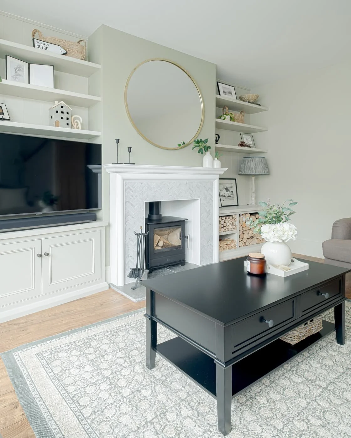
French gray, farrow & ball (chimney breast)
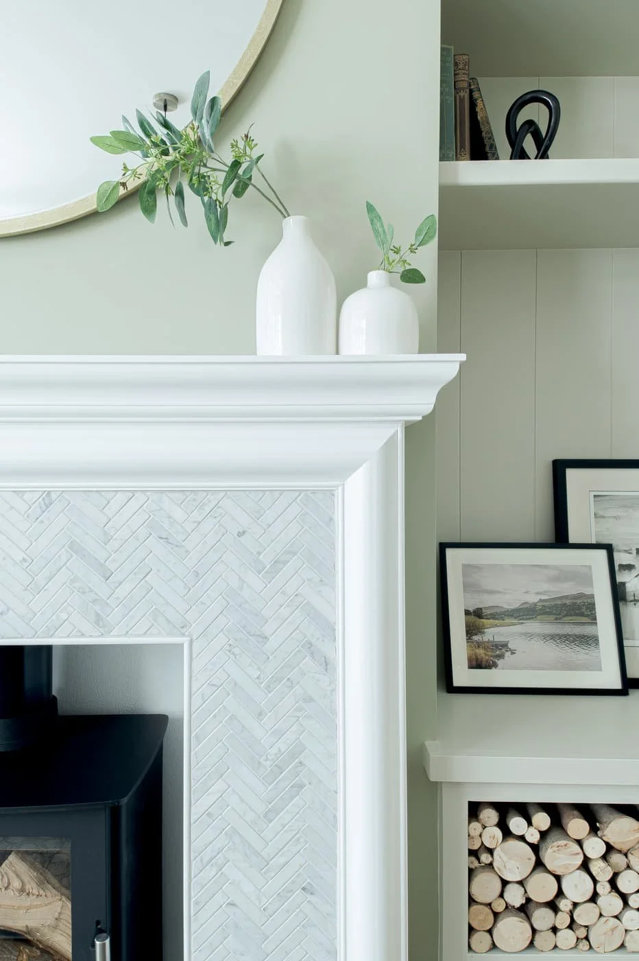
French gray, farrow & ball (chimney breast)
Best versatile green paint: French Gray by Farrow & Ball
French Gray is a muddy kind of green that changes beautifully throughout the day. It’s so calming, timeless, and will work in every single room of your home.
It’s perfect for:
Any room in your home (Bathrooms, Kitchens, Living Rooms, Bedrooms etc)
Exterior paintwork
Garden fencing
Genuinely, when this is applied to windows & front doors I think it helps create stronger kerb appeal! And I always use this colour when my client wants a nod to nature and colour without going too bold, so we often apply it on feature walls but honestly it’s so versatile.
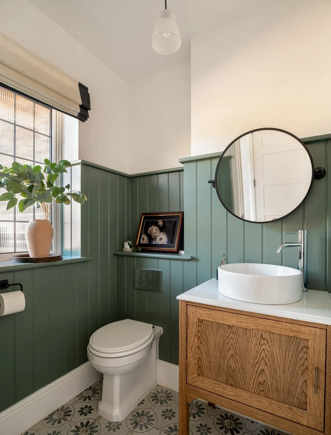
Best dark green paint: Green Smoke by Farrow & Ball
Green Smoke adds depth without making a room feel gloomy when paired with the right lighting and complementary colours.
I proposed Green Smoke in a client’s downstairs WC recently which gave the room a sense of identity again and I love how it turned out. It’s perfect for when you want to add incredible depth and drama to a room without it feeling like a dark hole. It’s an easy paint colour to design with because it sits beautifully next to so many materials, like wood, brass, chrome or marble.
It’s perfect for:
Cabinets
Panelling
Feature walls
Small spaces
One tip: continue the colour onto the skirting rather than stopping at white trim if you want a more contemporary, cocooning look.
It ended up looking OK in this room (clients will occasionally go their own way with colour application). I also suggest pairing it with a complementary white on the ceiling – like Shaded White not Brilliant White to elevate the design. God I’m nitpicking my own designs now, how funny! But I learn so much from every single project I do.
Before I move onto the next colour…
If you’re getting value from this post, let’s connect on a deeper level and you’ll get more support👇🏻
Binge watch my design videos & become a subscriber
Design your home quickly & professionally with a home design pack
Learn how to prevent mistakes & save thousands in our renovation online course
Best neutral paint for whole houses: Timeless by Dulux
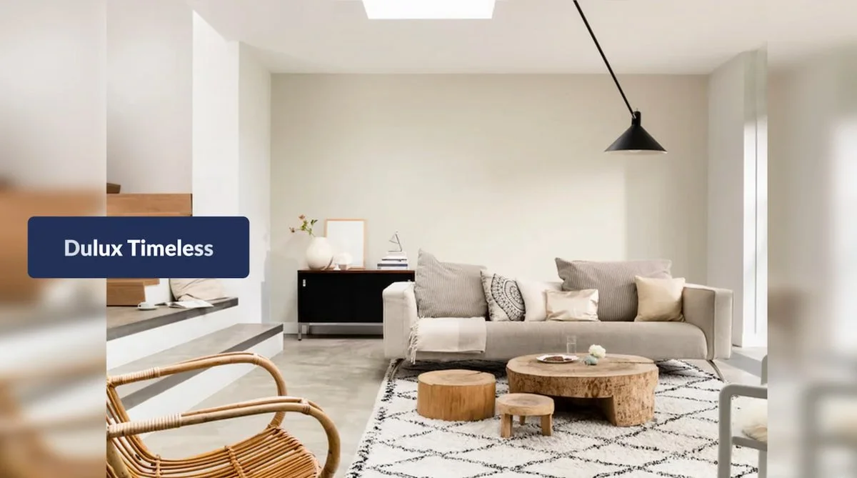
I understand the temptation when you need to paint a full property quickly, and you need a colour that works with a wide range of flooring, cabinetry and worktops. But don’t just go for Brilliant White everywhere, go for something like Timeless by Dulux instead.
It wins my vote because it’s a warm, versatile, light & airy neutral, it doesn’t have any yellow tones that can come up too magnolia.
It’s forgiving, adaptable, and it photographs beautifully – far better than brilliant white which can feel too sterile.
I’ve used Timeless in entire rental properties to give a consistent backdrop and it’s easier to maintain than Brilliant White. It brings a really considered look that still feels homely.
It’s perfect for:
Every room (if you need a quick refresh)
Woodwork
Ceilings
Zale’s powder by Ca’Pietra
Zale’s powder by Ca’Pietra
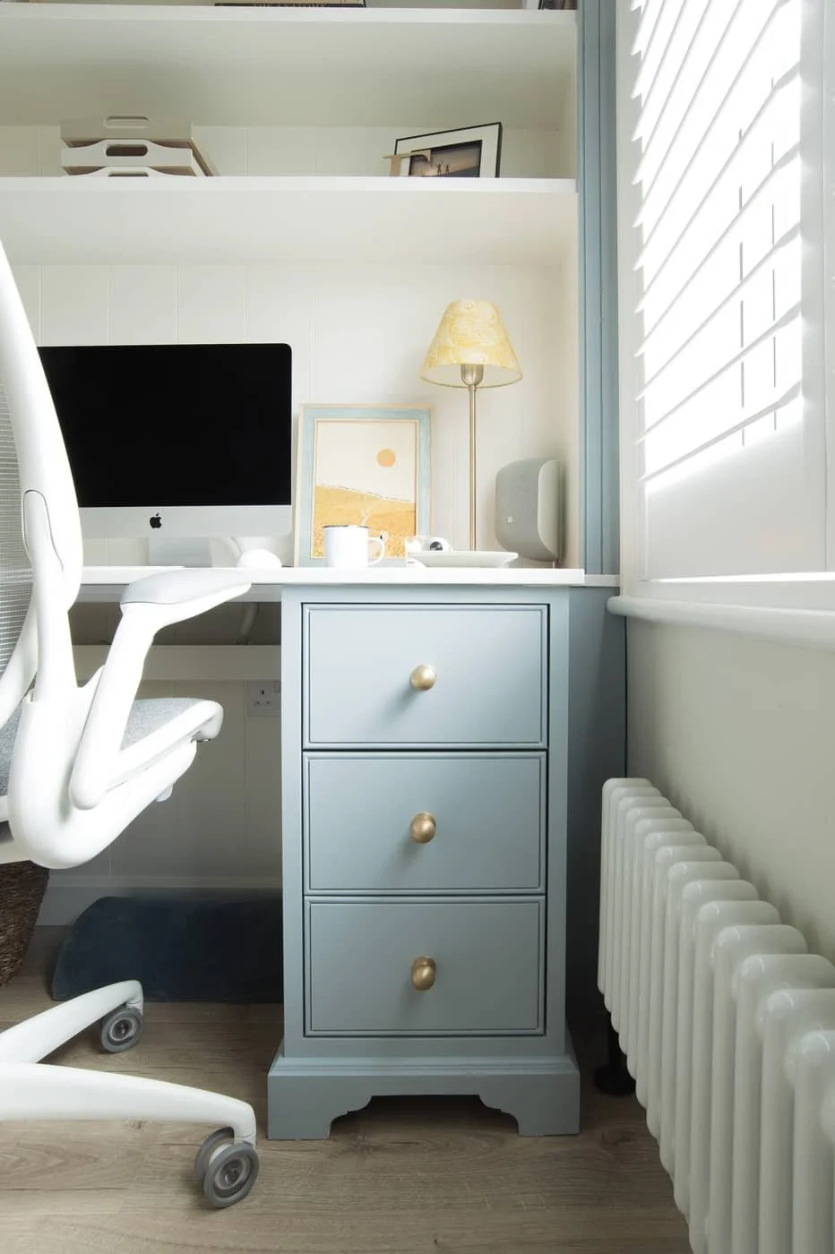
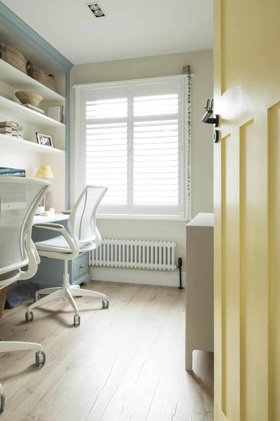
Best blue paint for bathrooms and bedrooms: Zale’s Powder by Ca’Pietra
Zale's Powder is a muted blue with grey-green undertones that feels calm without making a room feel cold. At the time of writing, it’s only available in the UK but if you’re reading from the US, try Little Greene’s Bone China Blue which is nearly identical.
I love applying this colour to spaces you want to bring a soothing, coastal-inspired feel like in bathrooms or bedrooms. And particularly when it’s applied to wood work, I always think it brings a playful edge, we have it in our home office paired with brass details.
It’s perfect for:
Bathrooms
Bedrooms
Home Offices
Cabinets
Panelling
But yeah, it’s a soft, muted blue with a gentle grey-green tint that makes it warmer than your typical blue – so your room won’t feel cold. It’ll be homely, calm and airy. I love it with textures like washed woods, seagrass and linen to complete the cosy-coastal look.
How do you choose the right paint colour?
The right paint colour is the one that works in your lighting, suits your home and still makes you happy after living with it for a few days.
Make sure you get samples, sit with the possibilities and see how they feel in your home.
Painting a room is such a big task that requires a lot of labour, you really want to make sure it’s the right colour scheme for you. And by the way, if you’re worried about painting and decorating yourself, we have guides and an online course that can help you.
Quick recap
Sample paint on movable boards
View colours at different times of day
Choose warm or cool tones based on how you want the room to feel
Don't be afraid to live with samples for several days before deciding
Those are my top 5 current paint colours that work every time. I hope you found this helpful, and if you did, take a look at our online courses & design packs for more support.
See you in the next post 😍