

The new colour range from Farrow & Ball
/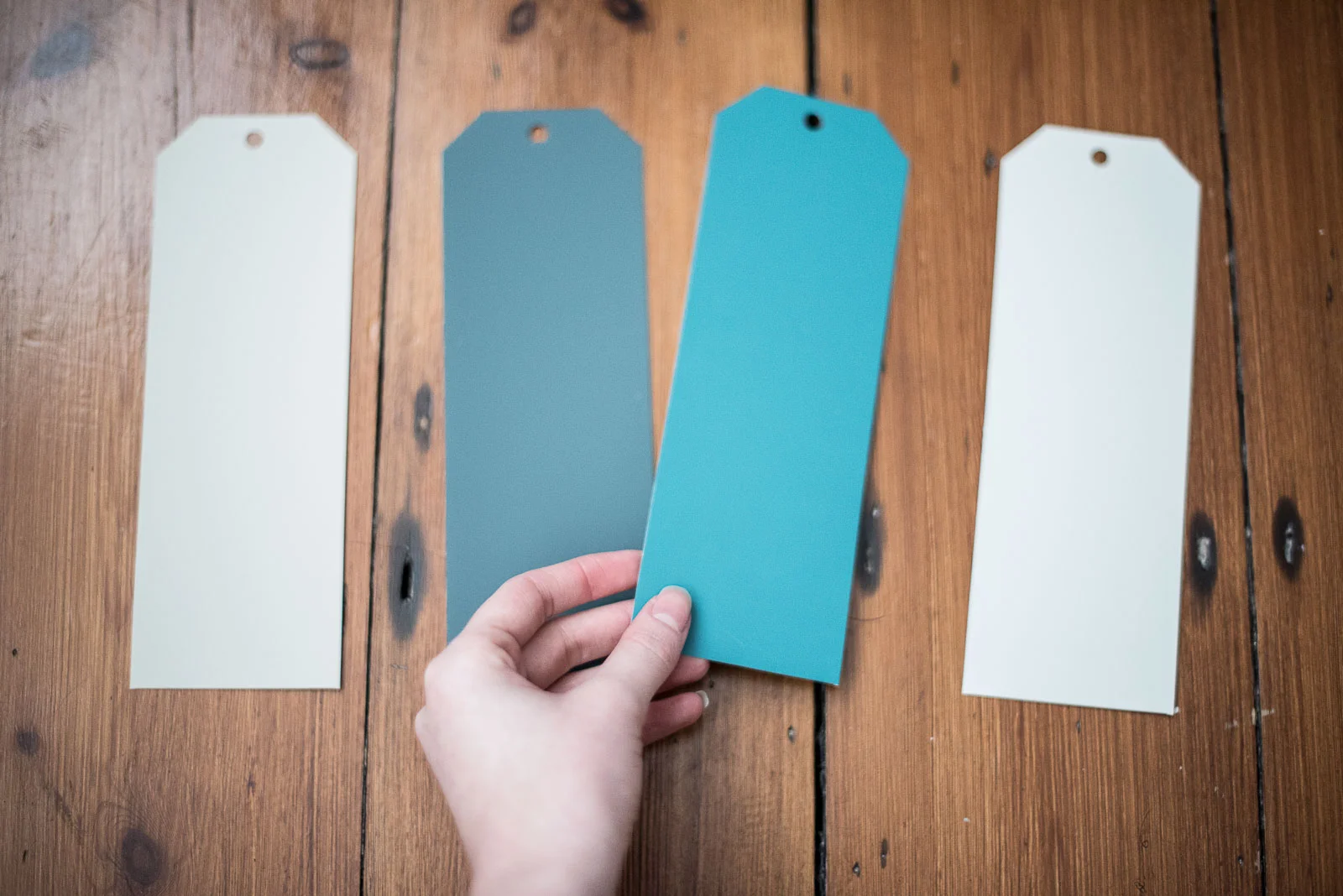
Yesterday Farrow & Ball released 9 new paint colours for 2016, all a rather modern take on period shades.
Yep, modern and period in one mish mash. Now that, I love.
For a while now, I've been a bit obsessed with teal shades and deep dark indigo walls. I saw a recent redecoration project on Karen Knox's design blog - The Blue Room - and I think it all began there. The strong blue walls with rich brown furniture and contrasting yellow accessories won it for me. Thanks Karen, my new obsession is all down to you :)
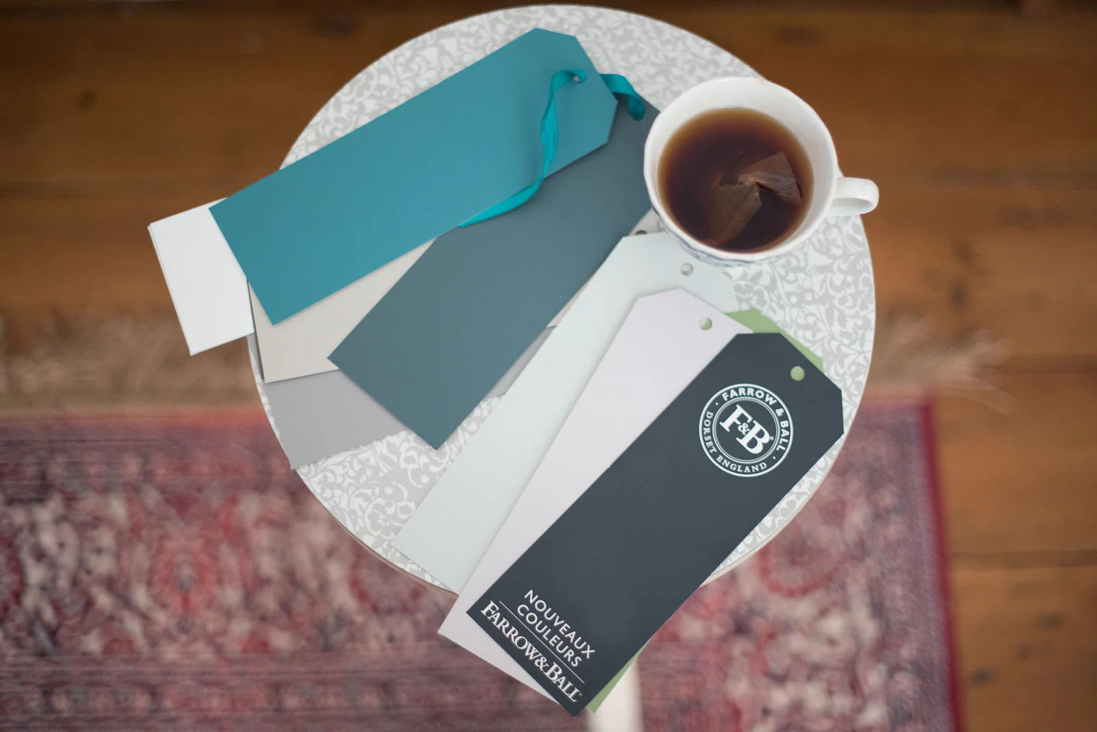
I was delighted to see Farrow & Ball's colour range has now introduced rich shades of blue that would create striking looks in any home - modern or period.
It's a brave move slapping dark paint on your walls, but a wise one at that. The warmth these shades create gives an overload of personality to a home and although I've never been brave enough to paint in such dark shades, I imagine the colours to be much easier to work with when it comes to pulling the whole look together.
Think about it, white walls are blank canvases. You have to be really creative with furniture to introduce colour. Whereas if you let your walls do the talking, you can keep your furniture and accessories pared down.
Copper fixtures for example, look incredible against dark blue hues. But against white, it can look clinical.
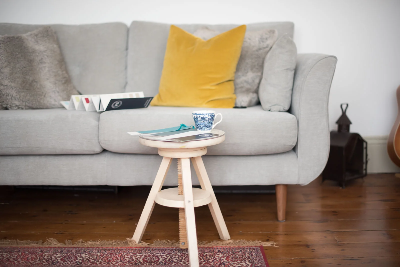
Anyways colour rant over. I love these kinds of days. Chilling back on the sofa dreaming up ways I'd decorate if only we had a few more rooms in the house...