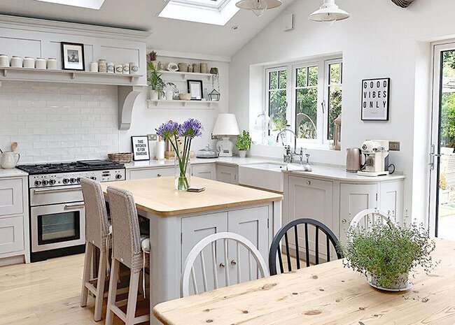
My Kitchen Diner Knock Through Renovation
This post contains affiliate links, more info on our disclosure page
Like the impatient blogger I am I have been DYING to share this post for over 6 months now, ever since we began planning our kitchen diner renovation – and finally, IT'S HERE! This is my dream kitchen makeover and everything that happened in between.
It's honestly everything I could have ever wanted in a kitchen. It's warm, inviting, simple, farmhouse homely and so 'us' it's unreal. If you’re looking for kitchen diner ideas, I hope this will inspire you.
How the space looked BEFORE we did the knocked through kitchen diner renovation
So this may require a little imagination. If you've read my blog before you'll know that we've had the kitchen and dining room re-positioned so that the old dining room has become our new kitchen, and the old kitchen is now our open plan dining area.
See our full plans here and why we ditched our initial 80K plans for this more affordable route...
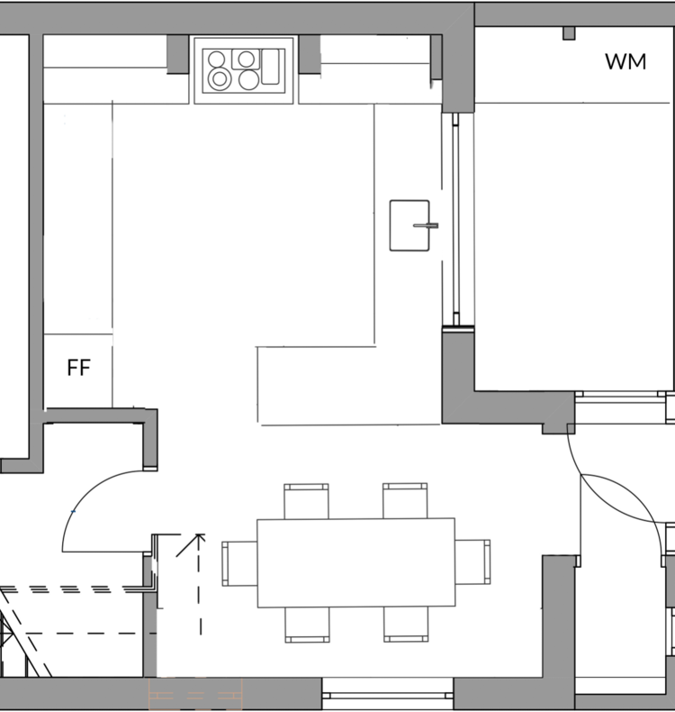
THE FLOOR PLANS BEFORE
THE FLOOR PLANS AFTER
You can see from the floor plans that we knocked down a dividing wall between the old kitchen and dining room to achieve a much better use of space.
The new kitchen has been fitted where our dining room once was, and our old kitchen is now one open space to fit a farmhouse table and chairs.
The double doors that once led out to the sunroom have been blocked to install a timber window above the sink, and the sun room is now a utility room.
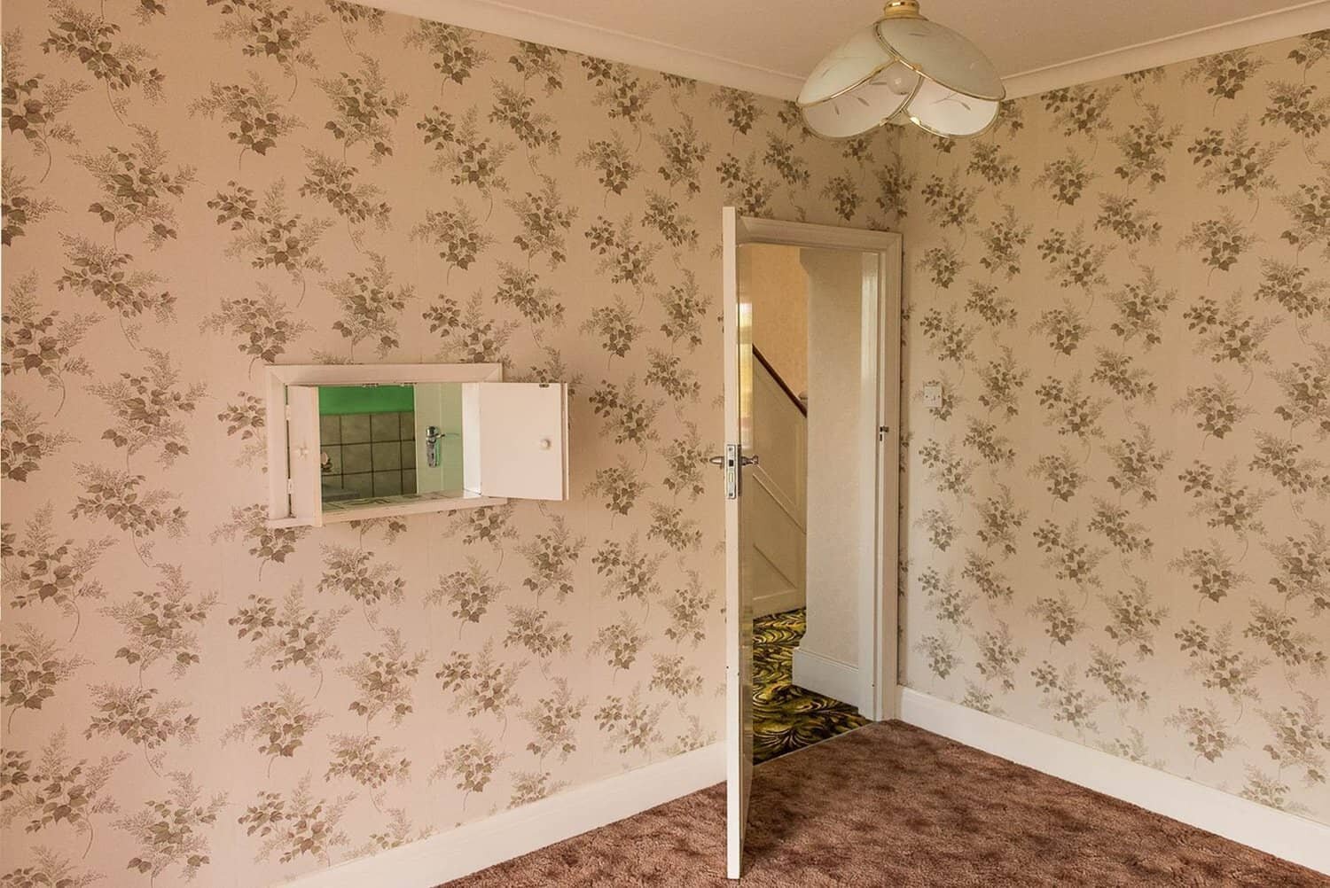
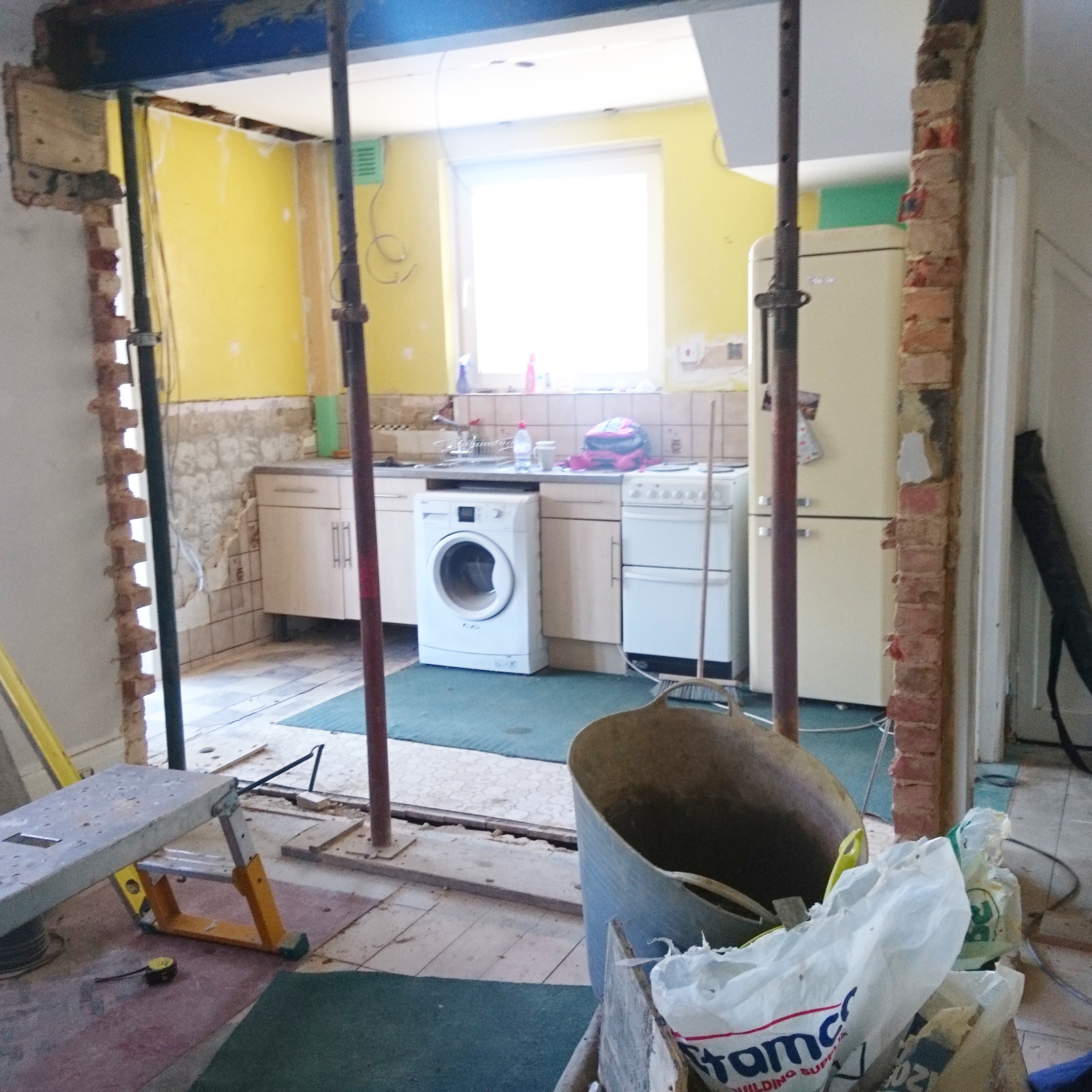
That’s the crazy big internal wall we knocked down, blocking up the original dining room doorway.
Should have kept the wallpaper, I know ;)
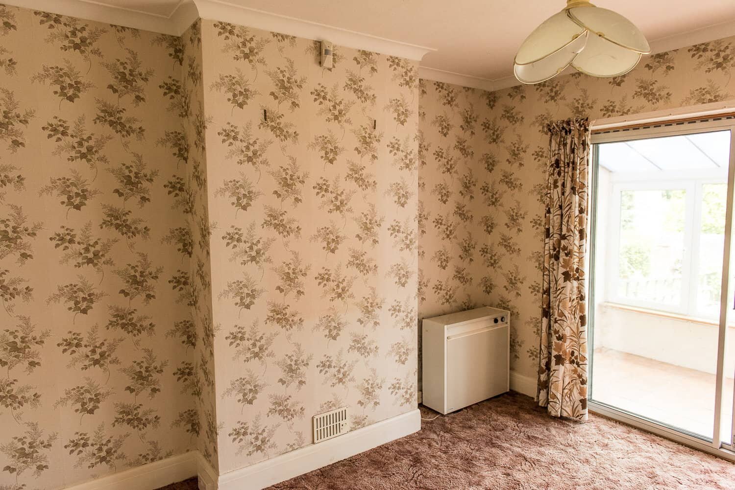
Before the Knock Through
Have you spotted the psychedelic carpet yet? yep.
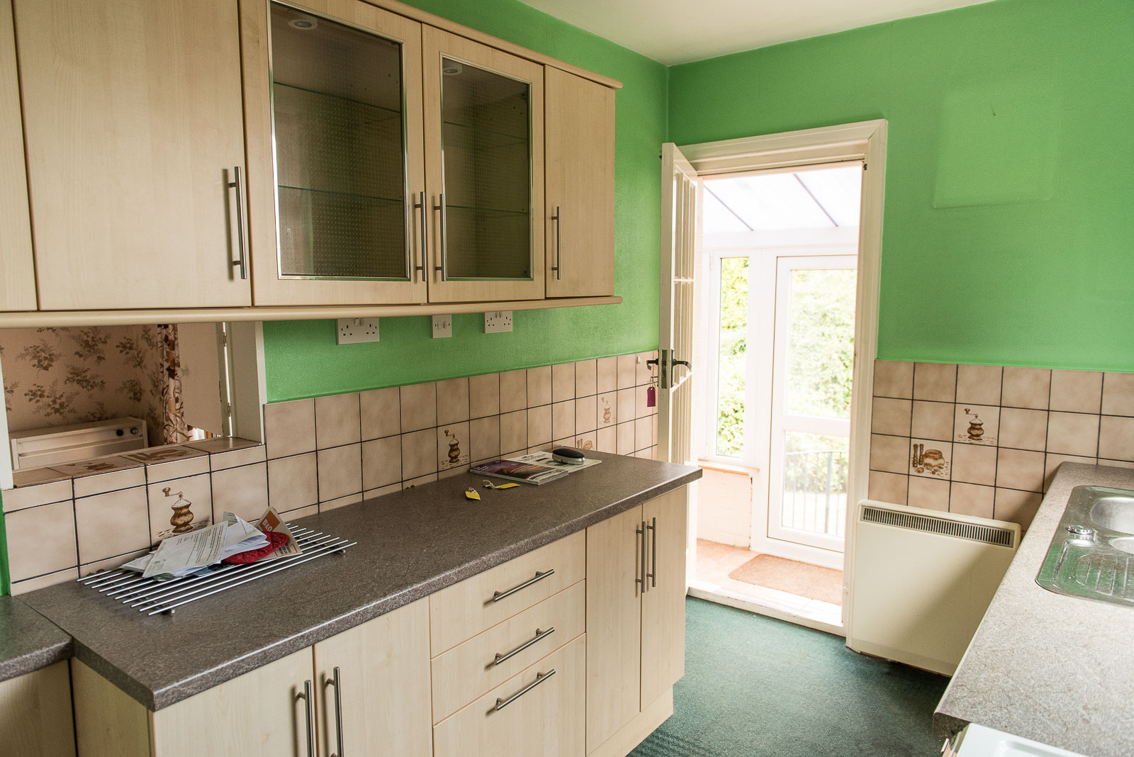
Above was the original kitchen we inherited when we moved in. It was actually in great condition. The previous homeowner had only recently installed it, but none of it to our taste.
The room was a typical galley kitchen layout (long and narrow) making it tiny and impossible to be in with 2 people cooking and washing up.
We knew the only way to make the footprint of the kitchen bigger was creating an open plan kitchen diner space, blocking up doors to maximise cupboard and worktop space.
How the knock through kitchen diner renovation looked DURING the work:
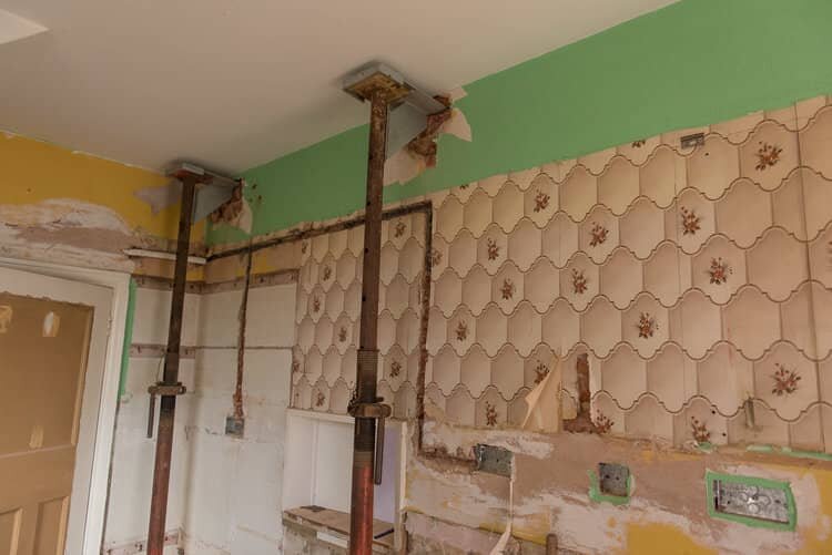
Every single wall and ceiling in the house had wallpaper on it when we first moved in (sometimes as much as 2 or 3 layers), and weeks on end were spent removing it, ripping up carpets and removing heavy storage heaters before work could begin. We planned meticulously before work began (if you’re planning on doing the same, use our home renovation step-by-step as a basis)
And then when the work began, it really began...
The kitchen diner knock through
I couldn't believe how fast the demolition work happened initially. Knocking down the load-bearing wall was something I was SO excited about, and will never forget! I was working from home for the duration of the build and had to leave the house because I could barely see my hand in front of my face thanks to the dust.
God, I will not miss the dust!
Having learned the hard way, being completely unprepared for anything like this, we’ve shared lots of tips and hacks for managing a stress free renovation in our online course for first time house renovators – there are ideas in there I wish I’d known about sooner, but of course hindsight is a beautiful thing!
Our builders became part of the family
We have the best builders who are trusted family friends and that made the whole project so much more fun – laughs a plenty every day and they completely understood the challenges of living and cooking in the space while work was happening (note: having a makeshift kitchen saved us all from insanity). They kept it as clean as possible for us and I really can't thank them enough for the work they put in.
Of course, we had our challenges we had to overcome, like the discovery that we’d ordered a lintel too small to support the chimney breast, and some rather rushed plaster work I wasn’t happy with, but we managed to overcome these issues with good communication between us and our builders (another area we explore further in our online course, How to Renovate a House).
How the open plan kitchen diner looks AFTER our renovation…
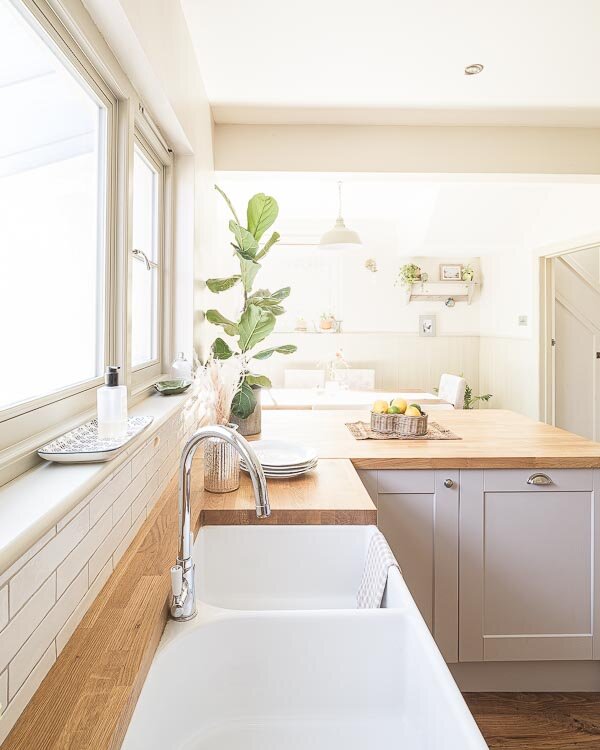
Here she is. Our beautiful new kitchen! We are so happy with it.
The Kitchen and Units
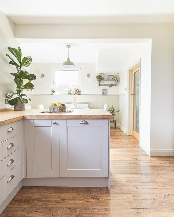
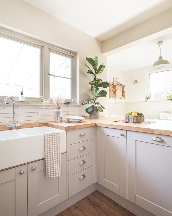
Our kitchen is the Howdens Fairford range in Cashmere, with solid oak block 40mm worktops. We chose to buy it from Howdens simply because we owned a Howdens kitchen in our previous flat which was great quality, I really liked the shaker kitchens Howdens supply, their design process was so thorough and flexible, and the whole kitchen came in on budget so it was decided.
I did consider an IKEA kitchen but changed my mind and later found out that builders often refuse to fit IKEA kitchens because EVERYTHING is flat packed – no surprises there. With Howdens (and other kitchen suppliers I'm sure) carcasses (i.e the white units that make up your kitchen) arrive assembled, making it less time to fit which costs you less money in labour. You might think you make a saving on IKEA kitchens, but you'll spend the money you saved on the extra time spent fitting it, so I'm glad I changed my mind so early on.
If you aren’t sure which kitchen to buy, my post “Why we turned down an IKEA Kitchen for Howdens” may help
The overall kitchen diner cost
We had a reasonable but still pretty tight budget for all this work so inevitably hours of research went into even the smallest details like the skirting boards, because I knew we didn't have a lot of money to play with.
If you’re interesting in finding out our renovation costs they are shown as an example within our budget planner that appears in our renovation online course and we have a high level breakdown within our post entitled “how much does a renovation cost”. We also have a post about the Howdens price list which is worth checking out.
Anyway more photos....
Working on the open plan kitchen diner layout
Something we have always wanted since the day we moved in is to open the front door and be able to have a long view like this straight out onto the garden.
So when it came to planning the layout, we made sure internal doors were all made of glass for this reason alone.
The glass door has allowed light to flow throw the house really well. Our initial, much grander plans were to open up and extend the whole back of the house which would have made the kitchen so much brighter than it is. We got estimates in to have large roof windows installed in the extension to allow light to flood in and views of the sky but quickly we realised the project would take us not double, but TRIPLE over the budget we had. So that dream was zapped pretty quickly. Read more about our reasons for scaling back our project here.
Getting the flooring right
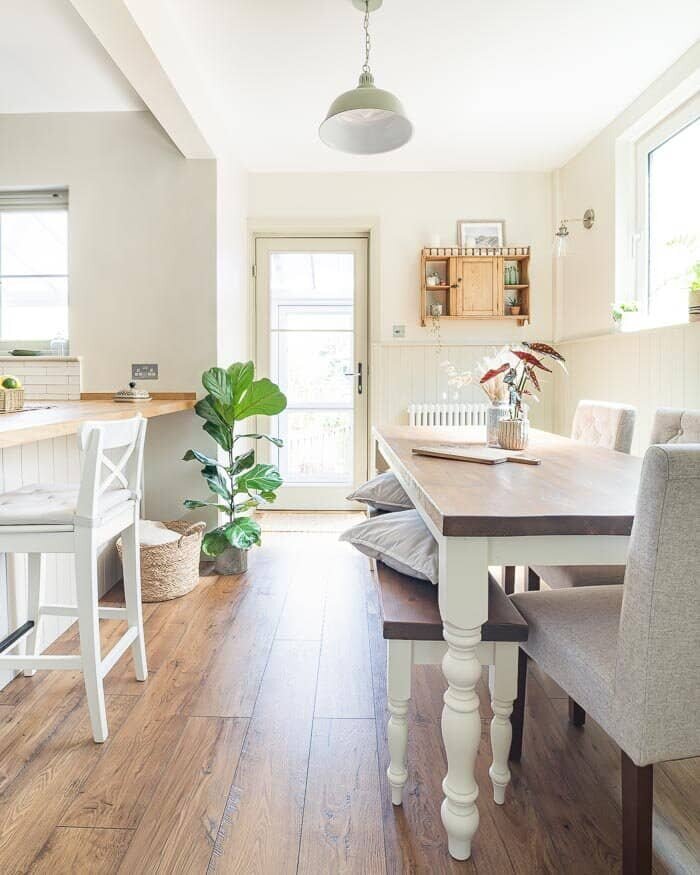
I love how our laminate wood flooring (or rather laminate wood-effect flooring) (by Quick Step) runs throughout the whole ground floor. We wanted unity throughout the rooms, and it was Neil's idea to have the same flooring throughout to achieve this. I think it works really well – well done Neil :)
I'm particularly happy with this flooring because besides it looking beautiful (and almost like real wood, it's laminate!) it's also an extremely durable and practical solution. The flooring was laid before work had finished so it was refreshing to be able to relax knowing it could withstand knocks and bumps from workmen's boots and plasterwork.
The windows & doors
Here's a closer view of our new timber door which we had custom made and painted by Bereco.
It is absolutely solid, safe and triple glazed, which was really important to us because we needed to heat the house efficiently, making sure we weren't losing heat out through the sun room/utility room (it was deathly cold in there during winter months before we renovated everything).
I initially struggled to find suitable windows and doors to suit the era of our house and the shaker look I wanted, until I found Bereco who made this timber window for us. I’m so happy I did find them as the door and window which you can see in the next pic down tie the whole look together.
Read more in my post on timber windows and doors.
Heating the kitchen diner space
Our house has never had a central heating system – we installed a boiler and heating system this time last year. This is a large open space that needed 2 heaters minimum; one to heat the dining area and one to heat the kitchen, so to keep with the period look we chose this beautiful column radiator from Plumb Nation for the dining area and a plinth heater by Smiths under the kitchen cabinets (read our post on how to heat a kitchen when you have no wall space). You can see it just below the pan drawers in the pic below.
A genuine dream of mine and Neil's (he does most of the cooking!) was to have a double oven similar to one his Mum and Dad has (a Rangemaster), with a shelf above it for me to style up seasonally.
Get our free 2 day email series:
How to nail your design
Cut through the online noise
How to get organised, prepared & even impress the kitchen professionals!
Extractor hood
One of the problems with our old flat was that the extractor hood on the cooker sucked the moisture into the machine rather than filtering it outside. So whilst it was an improvement vs simply not using it, the moisture was still hanging around inside.
So here we had the opportunity to install one of these Bosch Serie 4 extractors hoods (also known as chimney cooker hoods or extractor fans) that allow you to expel the air via a duct to the outside. Much better than the moisture hanging around inside and we love how slimline it looks from the front.
To get the air flowing outside, the builders drilled a hole in the chimney breast underneath the floor upstairs and then another one on the external wall, using ducting to create a through-draft.
For information you can read our post for details about our in chimney extractor fan.
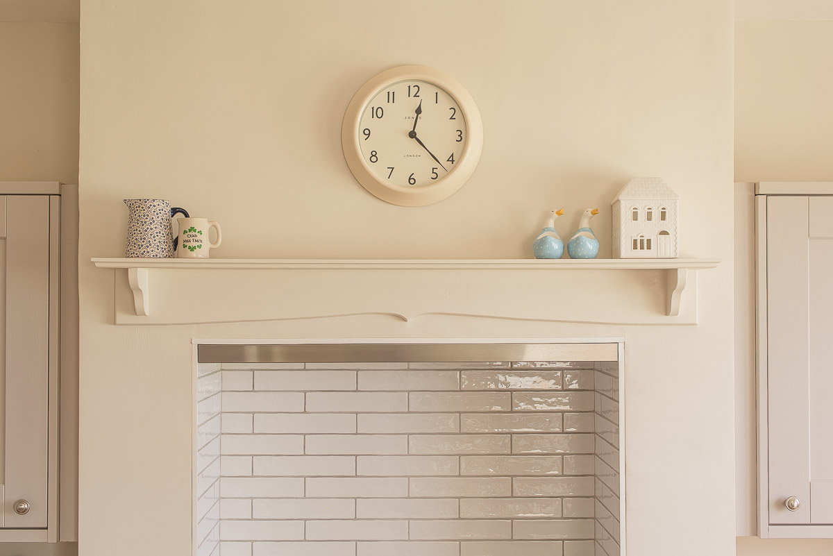
Installing a shelf above our cooker
The shelf we installed was made bespoke for us by a lovely local carpenter who lives about 5 mins up the road that I met on Instagram – thank you Luc! We also commissioned him to make our farmhouse table and bench, see pics of it below. There are very similar options on Etsy, built bespoke for your home at such cheap prices - Similar kitchen shelf here, and a gorgeous peg rail shelf, I also modelled our table on this farmhouse table available on Etsy and there’s a Laura Ashley Dorset White Dining Table that is not dissimilar.
Modelled on this farmhouse table
I wanted the dual fuel range cooker to be the focal point in the kitchen and I love our how Rangemaster (similar Rangemaster here) fits snug inside the old chimney breast leaving room for my shelf above. It's a dream to cook with, as are my beautiful new pans from ProCook.
The Colour Scheme
Neil and I did all of the decorating ourselves to save money and not hold up the project. The colour scheme we used was actually a recommended scheme I saw on the Farrow & Ball website. Super easy.
I knew I wanted the softness of Farrow & Ball's Bone on all of the woodwork (it's the colour we had in our old flat) but I didn't know what colours to put with it that complimented both the flooring and kitchen units. So I clicked on the F&B site and saw that the recommended colours to pair with Bone. They recommended Slipper Satin and Lime White. It was sorted, that's what I lead with.
The walls are Farrow & Ball's Slipper Satin but colour matched with Valspar paint from B&Q. I adore working with Valspar paints and regularly hop between theirs and Farrow & Ball's paints throughout the whole house. I chose Valspar for the walls because they specifically stock paint that's mixed specially for kitchens plus it's that bit cheaper than F&B paint. The woodwork we used Farrow & Ball paint for.
Column Radiator like this from Soak.com
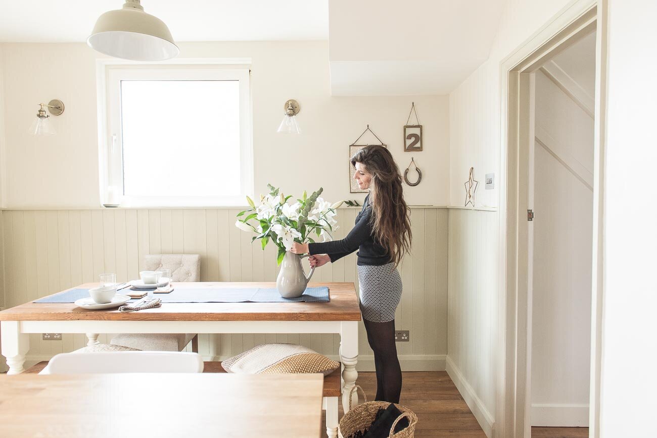
Honestly, I don't normally have the table dressed with plates and flowers but with tableware this gorgeous I couldn't not! I am loving Murmur's Northern Irish table linens and wares at the moment. They stock some timeless fabrics for any occasion and I'll be using these for gatherings we have planned in the new year.
The finishing touches
When we designed our kitchen with Howdens, instead of having the whole row of top cupboards with closed doors on we decided to have an opening shelf to vary it up visually... and it's another place for me to style up yaaay :)
We had a bit of a faff trying to decide what to do with this opening when it was actually built though because we wanted to include a wine rack but didn't want to shell out ££'s for a bespoke made one.
As the Chief Wine Connoisseur of the house I got Neil to assess our options. He did some research and found a company called BottleBlock who make stackable blocks, no glue, no nails required, just blocks of wood that you slot in place to create this bespoke beehive look wine rack which can be changed, removed or repositioned later down the line (if you gave up alcohol perhaps!) It saved us so much money as we thought we'd have to get a wine rack made up at the risk of not liking it or it not fitting. We are delighted with how this turned out.
The kitchen tiles
Confession! Our kitchen tiles were about the only thing that we chose really last minute on a trip to our local Topps Tiles store in Lewes.
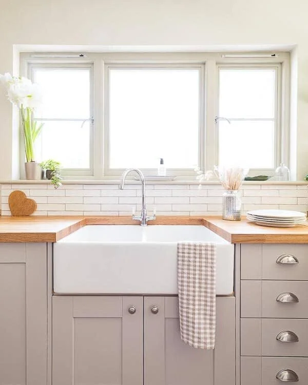
We went in there to order our gorgeous stone floor for the utility room and came out with the car full of these beautiful Artisau Gloss tiles in White for the kitchen (similar option HERE). I am thrilled with the way they suit the room given it was such a last minute thing. The light grey gunmetal grout we went for will make it much easier to keep the tiles clean in the high traffic cooking/washing up areas too.
STILL HAVE TO GET A BLIND FOR THIS WINDOW – CONSIDERING MAKING MY OWN, EEEK!
The sink of my country farmhouse kitchen dreams!
Getting our double belfast sink from Tap Warehouse (similar sink here) installed fulfilled another kitchen dream of mine. I'm the girl who types into the Pinterest search bar "belfast sink" and just scrolls through hundreds of pics on a weekly basis! Seriously! If you like the taps, similar kitchen sink taps can sourced on Amazon.
In my eyes, no farmhouse-esque kitchen would be complete without a belfast sink, and every time I'm washing the dishes in it – OK it's rare, we have a dishwasher for the first time now, but still – I just stare at it in disbelief and feel so happy we chose this over a normal silver or white ceramic sink. The joy it brings me is a bit ridiculous.
It's just a sink, Fiona!!
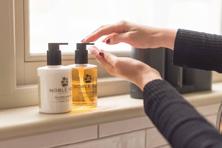
We got a double belfast sink so that we could use one bowl for washing, one for drying. It’s great for protecting water on the wood worktops. Oh and there’s my super luxurious hand wash and hand lotion by another new favourite company of mine – Noble Isle. Obviously it's too nice to use every day and only on special occasions ;)
Moving into the dining area…
This room comes into it's own when the family is over and chilling around the table waiting for us to serve up the food. It's going to be especially nice this Christmas because it's the first time my Nan can come for Christmas Day without having to worry about climbing lots of stairs. We usually host Christmas at my mum's down the road from us, she lives in the first floor flat where I grew up and my Nan often worries about the stairs. It's going to be brilliant spending it all together worry-free.
Some favourite accessories in here is my Weaver Green rug which you can see poking out below the breakfast bar there, my wicker basket from Rose and Grey and my butter dish there on the counter, which was a gift from Neil's Mum and Dad.
I WAS IN MY ELEMENT WITH ALL THESE TABLE DECORATIONS FROM MURMUR
By the way, in case anyone has noticed, it appears as though we are 3 chairs short around the dining table – and good spot in that photo, yes we are! – on this particular day our lazy bones got the better of us the day the chairs arrived (Moda from Next).
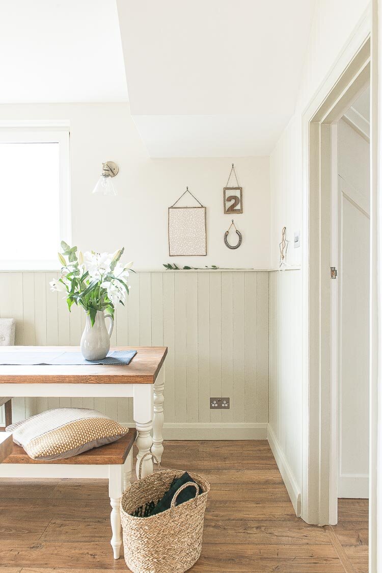
This is one of my favourite corners of the house now. I like to think of it as my 'lucky' corner with the horse shoe that my ma bought me when we visited my twin bro in Belfast, and the number 2 (my lucky number) that Neil bought for us originally for a gallery wall we have yet to put up in our living room.
The frames are from Rose and Grey and are pretty perfect for magpies like me who sees a new print they love and wants it on the wall asap. These frames are so easy to change up as they open up like doors. You can slot things into the glass and change them regularly.
Tongue & Groove panelling in the dining area
Neil came up with the idea to put tongue and groove panelling surrounding the farmhouse table and I instantly loved it. It brings a shaker / farmhouse vibe to the room and is so much more interesting to look at than if we were to have kept it as an average wall. The skirting boards for the house we always pick up from the Skirting Board Shop online. They have speedy delivery and a good selection.
Here's me hoping we'll spend many many happy years together cooking for family, friends and each other in this space. It was a labour of love, but absolutely worth every tear shed.
A huge thanks to all of the people and brands mentioned in this post too, some of which gifted us products for the project.
If you're renovating soon, there are so many ways we can help you in this next chapter of your life that will save you lots of time researching the best and most affordable things, how to budget, how to design, how to plan layout, and lots lots more – we've been there!
A great way to get started with your kitchen
We are so happy with the decision we made and even now we’re still as in love with our kitchen as when it was installed. Kitchens are the heart of a home and it’s important you get it right, so if you’re planning a renovation, get free access to our guide How to Design & Order a Kitchen which contains many tips and tricks not available on the blog itself.
Thanks for reading this and for supporting my blog! We hope this helps you,
Fifi (+ Neil) xx
Source list:
Flooring – Quick Step
Windows + Door – Bereco (painted in F&B Bone)
Column Radiator – PlumbNation
Plinth Heater - Smiths
Shelf – Local carpenter
Cooker – MyRangeCooker
Saucepans – ProCook
Table runner + table accessories – Murmur
Customisable wine rack – BottleBlock
Tiles – Artisau Gloss White from Topps Tiles
Belfast sink – Tap Warehouse
Soap – Noble Isle
Rug – Weaver Green
Magazine basket – Rose & Grey
Dining chairs – Moda (Set of 2 from Next)
Frames – Rose & Grey
Skirting Board – Skirting Board Shop
Other posts you may like
This post contains some gifted products and some affiliate links but all reviews are my own. I only ever feature companies I have experienced and highly recommend.


